Matthieu wrote some observations he'd made regarding the real world weathering patterns on the GT NSC 50' boxcars, and how he'd gone about trying to replicate them when weathering his models. He mentioned that he had used white and beige colours to fade the original GT blue. Matthieu also noted that the GT cars tend to develop light rusty areas in the upper regions of the panels.
Here's the link to the Hedley Junction blog:
http://hedley-junction.blogspot.com/2019/08/weathering-atlas-gtw-nsc-boxcars.html
In the past, I've found that fading with white can be tricky. Just a little too much white and the model can easily take on a "frosty" tone, and that's not what we ever want. The only paint close to a beige that I have on hand is ModelFlex Concrete Grey.
And I could also use a little practice with the Burnt Sienna PanPastels that I've got, so I thought I could use that for the light rusty areas..
I thought I'd give all this a try on a Scale Trains boxcar that I'd weathered before, but I was never really satisfied with the faded blue that I'd achieved. It hadn't turned "frosty" as I referred to above, but just didn't look right to me. The blue was still too bright.
So, I loaded a little bit of Concrete Grey into the airbrush, double-checked that the spray was set for a fine mist, and away I went.
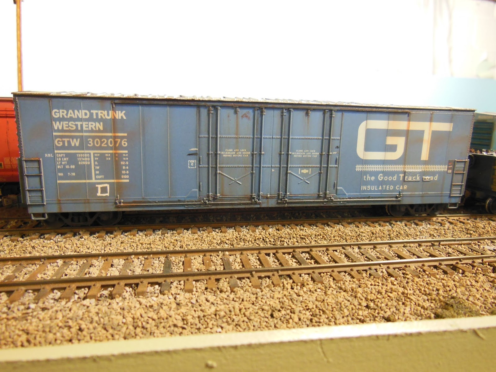
Here's how it turned out.

I think the fading of the blue turned out really well. On this side, to get a little bit of colour variation, I deliberately sprayed less of the "beige" on just one door. And if you look closely at the panels about midway up the GT logo, you can see the subtle rusty areas that I did with the PanPastel. The streaking rust from the door tracks and panel seams, as well as the darker grimy areas were there from my previous weathering job.
The other side of the Evans boxcar from Scale Trains. I like this car and would like to get a couple more. This is from Scale Trains "Operator Series", so the detail is about on par with freight cars from the old Athearn Blue Box or Roundhouse line. That's okay with me though, because at least the detail parts don't break off and disappear just because you've actually run the freight car on your layout. One thing that does bother me about this car though is the incorrect location of the tack board, which should be on the first panel to the left of the doors

And here's a look at a Roundhouse car that I've coincidentally just finished weathering for another modeler. The spacing and location of the lettering on the left side of the door is wildly incorrect, but at least the tack board is in the proper location. The 2 panels to the right of the door area patch painted and there are several patches on the door also. I faded the paint on this one by airbrushing with light coats of the same Concrete Grey that I mentioned above. And again, the rusty upper areas of the panels were brushed on with the Burnt Sienna Pan Pastel.
I have 3 of the Atlas NSC boxcars in the GTW scheme as well, but I'll save posting those for another time.
Great looking models Jim...always liked the looks of the GTW fleet...George
ReplyDeleteThanks very much George. I'm glad you like the models. I'm hoping to find maybe a couple more when the shows start up again in the fall.
ReplyDeleteJim
Happy to see how your models turned out! Honestly, they look great! Since our last discussion, I've been wondering is a subtle wash of baby/sky blue wouldn't help fading the paint without creating that frosted effect you mentionned. Often, military modellers will tone done paint using a similar lighter shade to create variation. Sure, their models aren't generally lettered like ours, but I feel it could be an interesting experiment!
ReplyDeleteMatthieu - yes, I've used lighter shades of original colours before, and have had some success. I did like the way these turned out using the beige tone though, and wonder how other colours such as green or yellow would turn out if beige was used over them.
ReplyDeleteJim
Nice work.
ReplyDeleteThanks very much Paul. Appreciated.
ReplyDeleteJim