When travelling I75 through Detroit, there's a section of the freeway that runs more east-west than north-south. And as you drive that section, if you look a little ways to the north of the freeway at the right moment, you might see the former Fisher Body Plant (building 21) off in the distance.
This photo below looks to have been taken from the corner of Harper Ave and Piquette St.
 I often thought it would be cool to have picture of the building on the layout as part of the backdrop. However, when I tried to edit the photo to eliminate the perspective, I could never quite get it to look right.
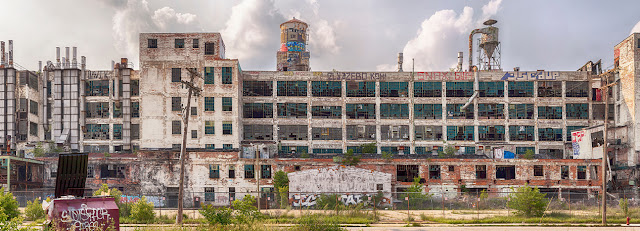
During another internet search, I found this much better view of the same building which was taken "square on" from just a bit further down the block on Harper Ave.
I cropped just a little bit from each end of the the 2nd photo and also removed some of the sky. No sense printing the sky as I was intending to cut it out afterwards anyway, and also eliminating what I could will allow the final images to be printed that much larger.
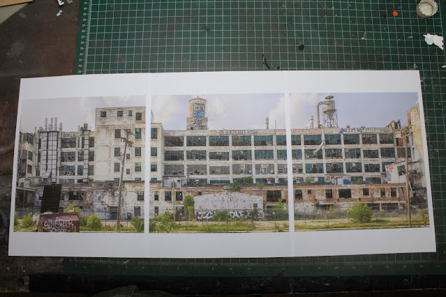
Next, I divided the cropped picture into thirds and printed those 3 images as big as I could in portrait format on plain old copier paper. I used portrait format so that I could print the images taller and closer to the height of the structures on the layout.
Once printed out, I of course trimmed the extra white paper from the edges, and mounted the 3 images onto a sheet of white construction paper that I had picked up previously from the local Michaels craft store.
I used 3M 77 spray adhesive to stick the images to the construction paper. That stuff sets up really fast, and as a result, I did manage to tear one of the images in the sky portion. You can see that tear to the left of the dust collector. But that was OK because my plan was to cut out as much of the sky as I possibly could anyway.
It took me about an hour or so to trim out the sky from the top of the pictures with my Xacto knife. And yes, I still have all my fingers and no bandages were necessary either. I also ran the edge of my brown paint pen around the edges of the picture so that the white edges wouldn't show.
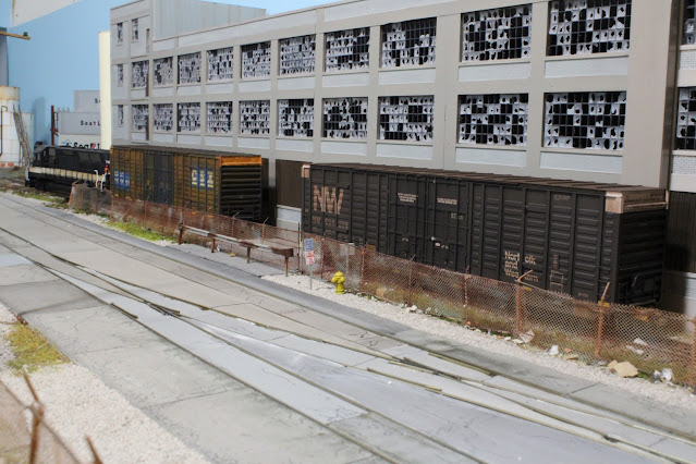
Here's the view from partway down the layout showing how the new backdrop piece fits in. The finished piece is about 25 inches or so wide.
This layout improvement project turned out just about as well as I had hoped, and in this view I think it blends right in !
Have a great week !


